There is a big disconnect between perception and reality in a world of click bait driven media, profit driven news, and an overwhelming amount of content at our fingertips. Fortunately we are seeing more and more massive collaborative efforts to make data live, public, and easily accessible. You may recall Hans Rosling’s TED talk: Debunking third-world myths with the best stats you've ever seen from over 10 years which wowed us with data and the ability to delineate historical events, impact and similarities between between nations which once seemed so different.
Sadly since then, Hans has passed away but graciously he left us a legacy and his work lives on and continues to grow on through the efforts of this son, Ola and his daughter in-law Anna through the Gapminder website and their newly published book Factfulness.
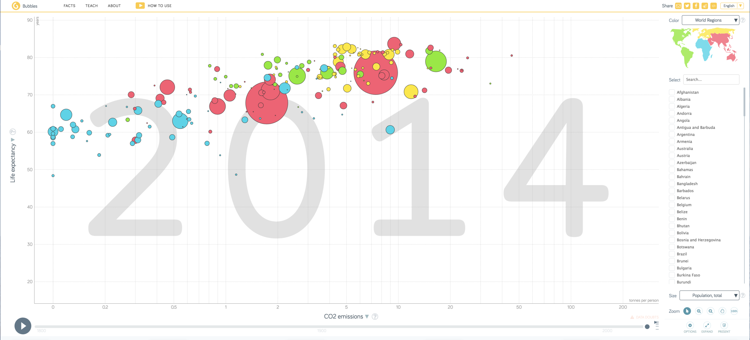
Gapminder Tools puts the data that wowed us a decade ago into the hands of anyone. Users can select from a from a large variety of datasets ranging from life expectancy to literacy rates, to energy, to name some from any country on earth over the past 100 years in various forms including maps, bubbles, ranks, or graphs, etc. Data comes to life, can tell a story, or unearth new truths for students.
Hans Rosling's FactPod: If you dig deep enough might be fortunate enough to stumble across the 18 part Factpod Series which addresses some of the world's most pressing issues such as Ebola, refugee crises and how Mexico is closing the gap on the US. What a gift for students and teachers. This is an amazing showcase of what his possible with data. I wonder what stories we will tell.